Whether your business has a bricks and mortar presence or is purely online, your website is a crucial component of its brand. The growth of the internet and of smartphones has meant that a website is not only crucial, it also needs to be mobile friendly and packed with interesting information. But on top of all of this is there a place for design in creating a better user experience? Is it about substance and style rather than one or the other?
Using white space
For a lot of us, the introduction to design came from things like newspapers and magazines where every inch of a layout was covered with words, images or adverts. But for website design this doesn’t need to be the case, less is often more.
According to one study, the use of white space around text and titles can increase the attention of the user by one-fifth. It also creates a fresh, modern and open feel to the website that is particularly relevant to modern or contemporary brands.
Bear in mind that white space does actually use space so above the fold sections you may need to balance it carefully. Don’t use too much white space and compromise important information.
Eye-catching call to actions
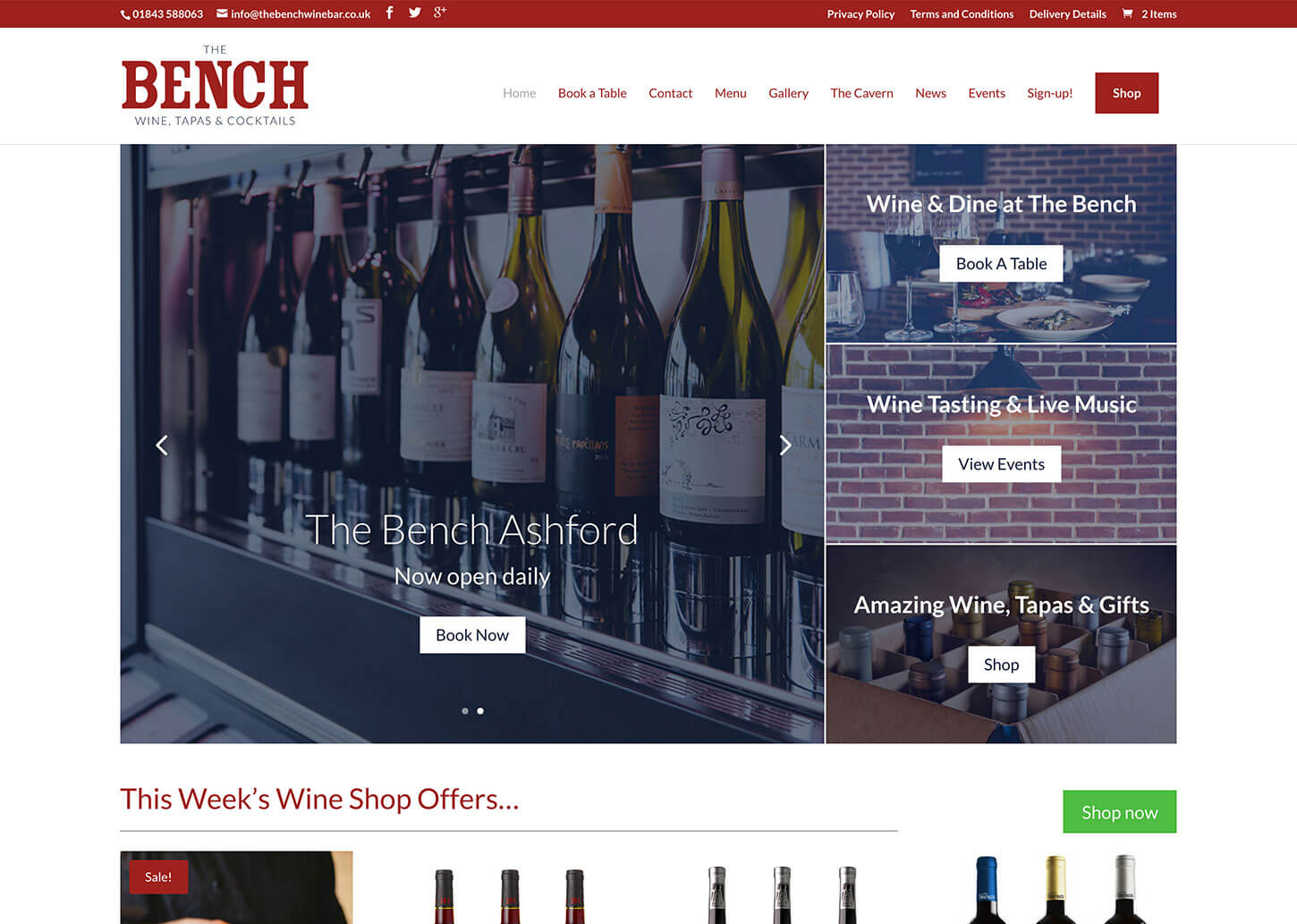
The call to action or CTA is a signpost that tells visitors what you want them to do. It can be anything from ‘Buy Now’ or ‘Click here’ to ‘Sign up now’. While the wording of the call to action is important and there are vast amounts of information written on the topic, sometimes the look of it can be side-lined.
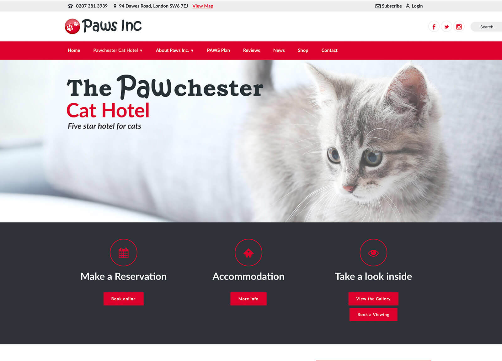
So when considering user experience design ideas, think about the call to action in visual terms as well as in context. For example, think about colour psychology and what colours will be harmonious with what you want visitors to do. Think about what emotions users will feel when visiting the website and pick the colours of your CTA accordingly.
Break up the information
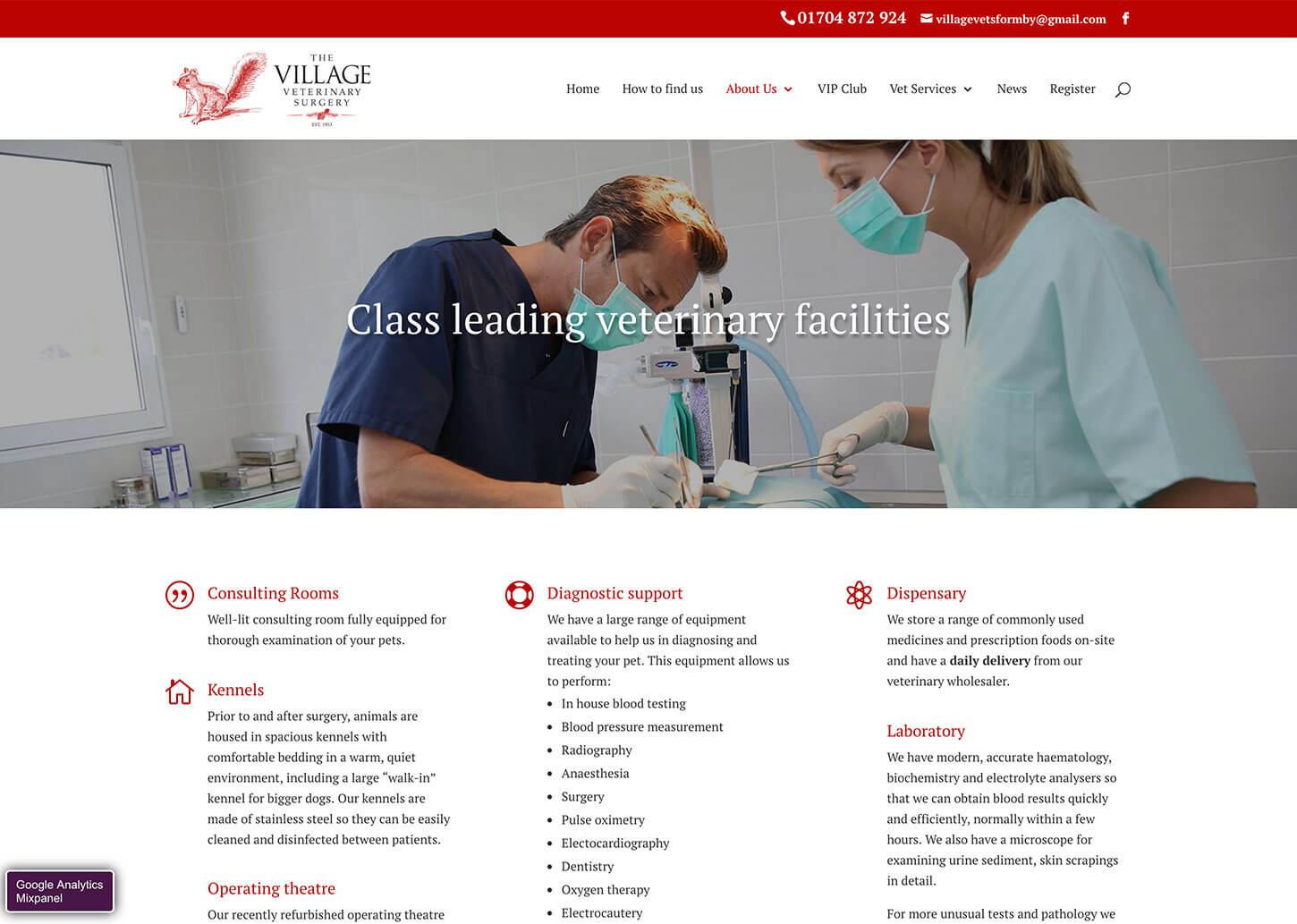
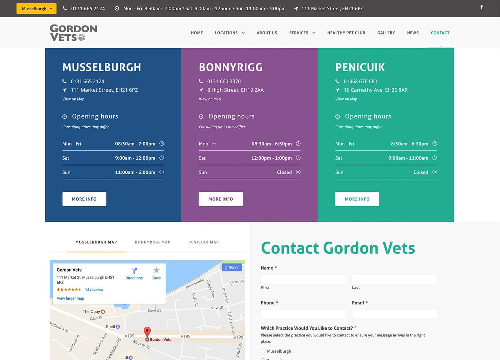
Sometimes a website needs to give a visitor a lot of information and it can end up seeming like an essay – some people just don’t have the time to get through it all! But breaking up the information in various ways can make it seem more accessible and less time consuming.
Bullet points are a classic example and have diversified into a whole range of different styles. The simple circle or square with a small piece of information beside it can work excellently in product descriptions. For something a little larger, icons can make a great visual impact, especially when paired with numbers or statistics. This is a great way to illustrate statistics, figures or other facts.
Use images but watch page speeds
Studies are always telling us that we are a visual species and this is why infographics have become so popular over recent years. Using images to illustrate pages, as dividers separating content or to simply improve the look of a page is a popular option for better website design. However, you should always be conscious of the effect that graphics can have on page speeds and the negative impact on website performance for users.
One of the best ways to deal with this is to use a tool or plugin that optimises images for you. This reduces the size of the image file without losing anything in terms of quality or detail and can help greatly with page loading speeds. Also consider the use and choice of images – make sure they are creating a benefit for the visitor rather than just being there for the sake of it. It may be that the space could be better used for something else.
The importance of branding
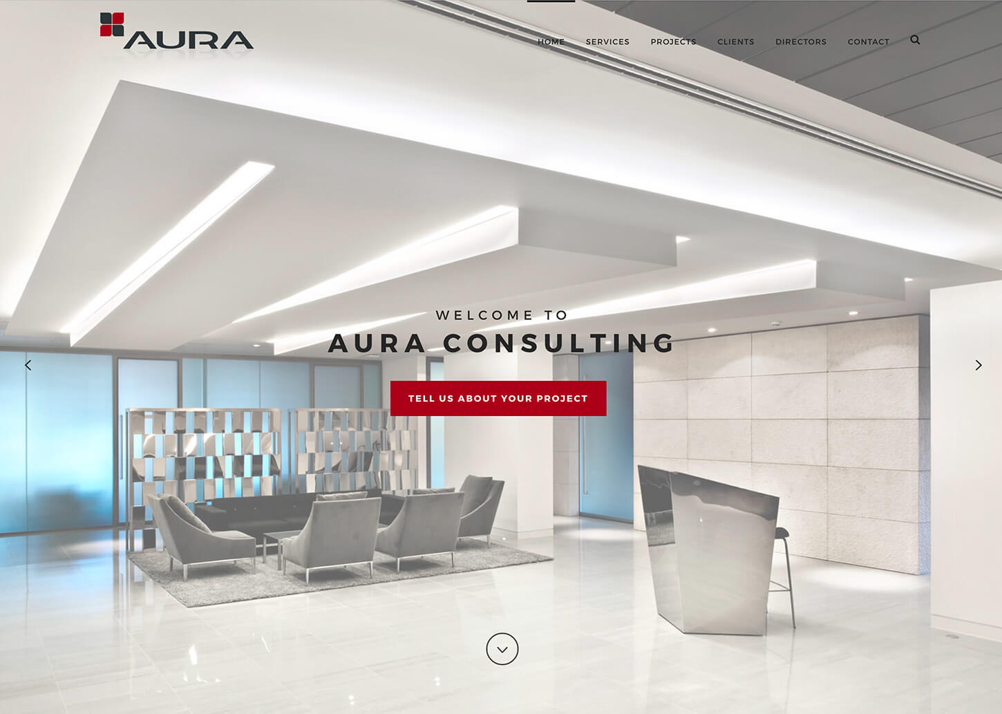
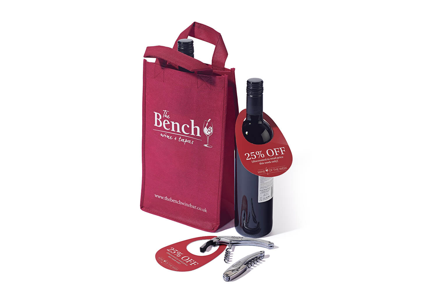
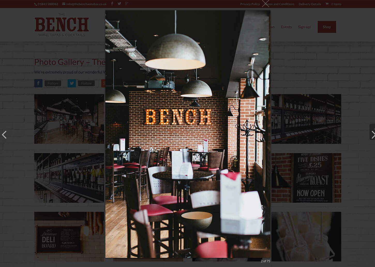
Branding is about more than just choosing a cool logo and using a couple of matching colours. It is about creating an identity for your business that carried through into everything you do. It is also about ensuring that all the little things on your website match and that these branding elements are also carried through to be used on social media wherever possible.
Branding incorporates many elements such as the fonts used, placement of elements on the website and other features. Anything that can be altered is, in one sense, a part of your brand. It is your identity for your business and is unique to you. It is also one way that customers can recognise your business across all channels.
Web design to enhance user experience is now every bit as important as the content of the website. Pulling all of the elements together is the best way to create an effective, eye catching and professional website that will have visitors returning time and again. For more articles on web design including SEO and finding the right web designer visit the category on our blog, alternatively have a look at some of our website design case studies.
