If your logo looked anything like Hollyoak Veterinary Surgery’s did when they came to us then your practice also needs a rebrand.
We don’t recommend a total veterinary logo rebrand for every vet we come across but in this instance Hollyoak knew they needed to make some drastic changes, so we obliged.
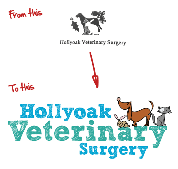 We just completed this rebrand and wanted to share it with you.
The business has been recently taken over by new management who were keen to see a much fresher, more colourful and friendly look for their business.
The new owners were very conscious that the current staff should be involved in the process. We trood carefully so as not to upset anyone. The current logo was ‘loved’ by some members of staff, and the general outlook was that things were ok as they were.
We were able to convince them that their image was the one thing that portrayed their professionalism and the caring culture evident throughout the practice. We used this as the main focus for the transformation. It proved to bea great way to help the staff begin to let go of the old ideals and begin thinking positively about what could be achieved and how it would benefit them in the future.
Stage 1 – Brainstorm
The client had expressed some interest in softer pastel colours and a more ‘sketchy’ graphic design approach, which they had seen used by another vet. We suggested exploring 3 options, using our usual ‘mood’ board technique we fleshed out some visual ideas to help the client understand our initial thinking.
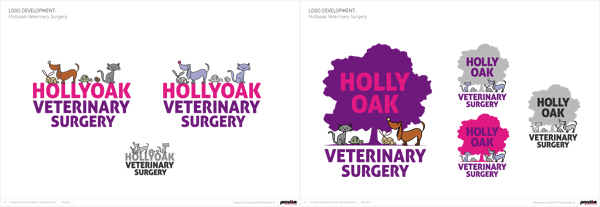
Option 1 – Using existing imagery of the Hollyoak ‘Quercus ilex’
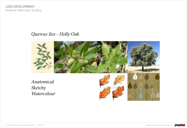
It turns out that the Hollyoak has a fairly boring leaf and is slightly reminiscent of a holly leaf but not as spiky but we wanted to show a concept for this so included it as an initial draft. We also felt that this was a good oportunity to use the imagery of a full Oak tree as this would be more semantic to the viewer and help convey a memorable icon for the business.
Using sketchy type fonts the following concepts were submitted.
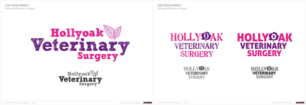
Option 2 – Caring, fun, colourful and incorporating the animals they treat
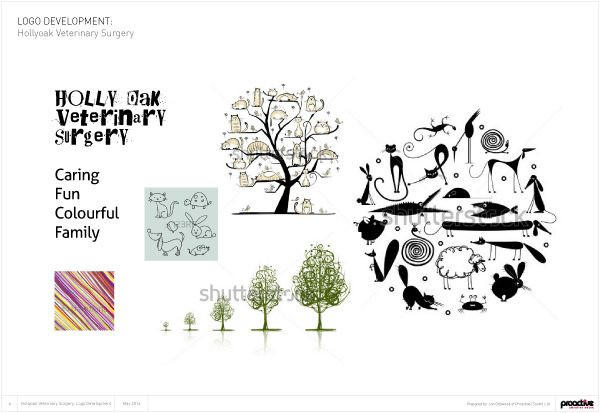
This concept was based around the animals. It was really important that they were fun and not serious in any way. Due to budget we opted for some predesigned stock animals that we knew were right for the job and set about customising them to fit our scheme.

Option 3 – Local landmark based imagery
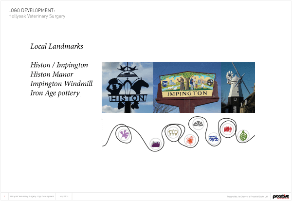
It was agreed that we didn’t need to follow this path as the local landmarks were few and far between, so we moved the design forward using the first two concepts – this thinking has worked for other customers but was not applicable once we started into the process.
Stage 2 – Refinement
After debate with the client and staff, it was agreed that they loved the animals from concept two and really liked the sketchy font from concept one, so we combined the two. They had reservations about the Robin and the Tortoise (as they don’t treat too many wild garden birds) but we persevered and added some more colour to all the animals, adjusted the tortoises’ shell and made the cat more ‘patchy’. We also generated a set of logos with upper and lower case lettering to show some variation in the text and a some colour versions.
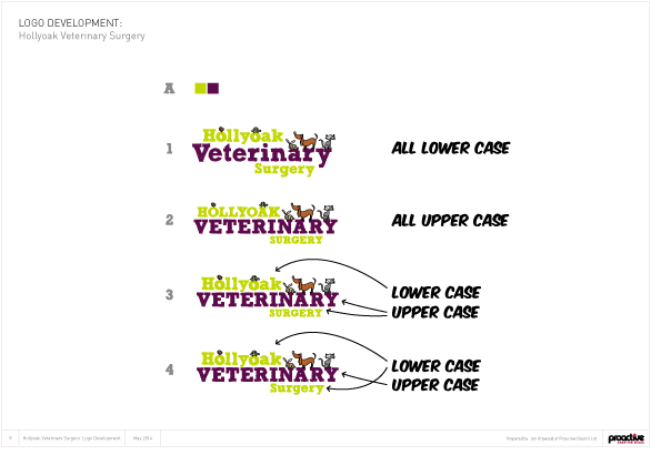
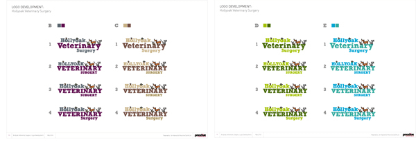
At this point the veterinary logo rebrand was almost complete, but we decided to make the animals larger and remove the Robin and Tortoise. It was agreed that the final logo colour would be cyan, blue and green.
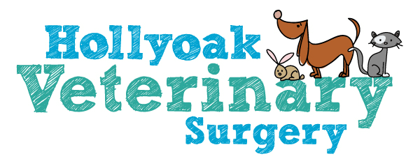
We are now using this design to create client care packs, healthcare prevention packs, stationery, badges and signage.
If you’re interested transforming your practices logo with a veterinary logo rebrand give us a call on 01202 315 333 for a friendly chat. We work with lot’s of vets, so we know what we’re talking about when it comes to branding.
