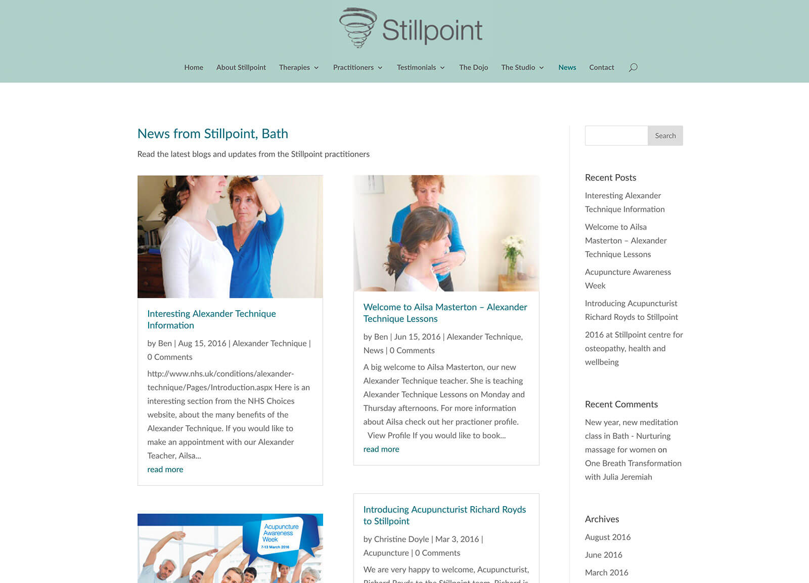
New osteopath website fixes user experience problems
Website project detail
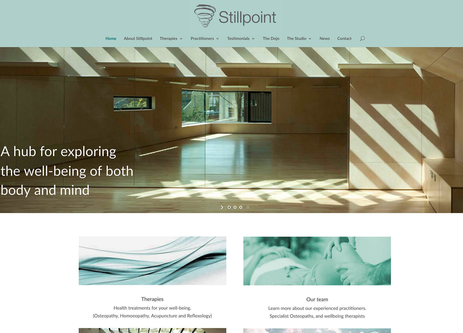
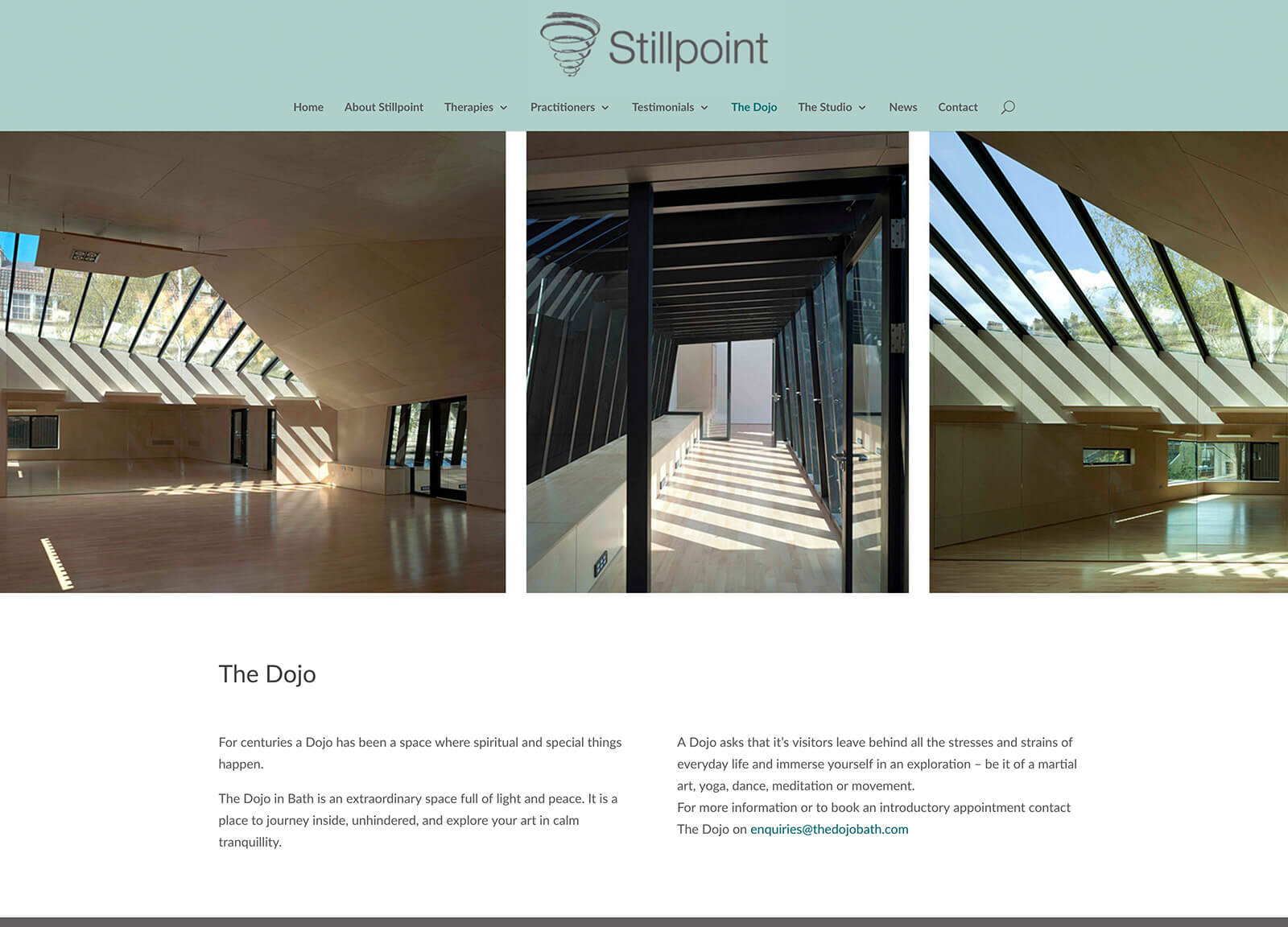
This osteopath website is designed to showcase the full set of health and well-being services available at the practice. Having previously helped to create a brand for Stillpoint we took the colour scheme and worked closely with the customer to build a responsive site that worked correctly.
The current site had inherent issues with nesting of menus and a convoluted menu system that would often leave you stranded in a page and unable to navigate back to where you’d come from. Other issues included the use of separate menus for each discipline which was confusing and disorientating for the user. We started from scratch, rebuilt the menu system so it was manageable and simpler to navigate.
The client was keen to keep the style as similar as possible to their current website. We took this on board and introduced a wider format and with the addition of full width sliders and blog functions plus the dynamic features of the new WordPress theme, added a fresh new look and feel.
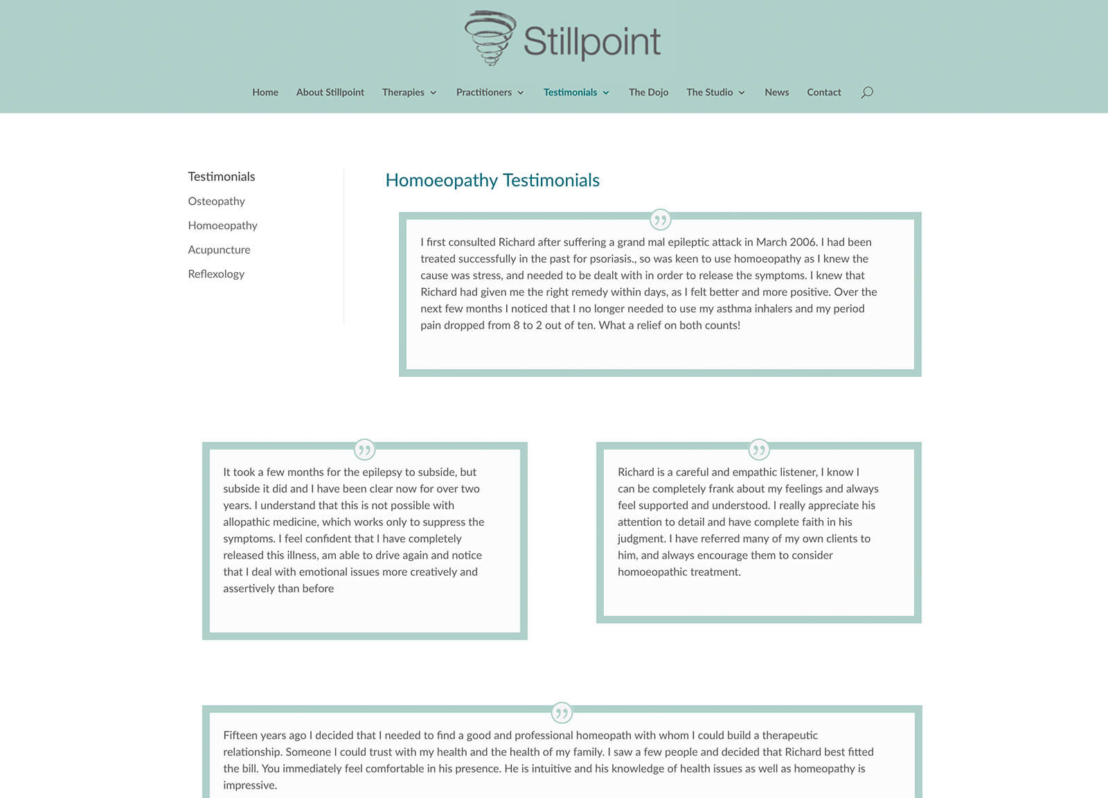
This site has grown to include many new members of staff, so the introduction of globally styled modules in the CMS (content management system) has made the addition or removal a simple procedure for anyone to complete.
This is a good example of an osteopath website which could be applied to any multi-service company with a large number of support staff.
Details
Osteopath website design features
- Responsive design
- Search engine optimised
- Google Analytics
- Fullwidth Image Sliders
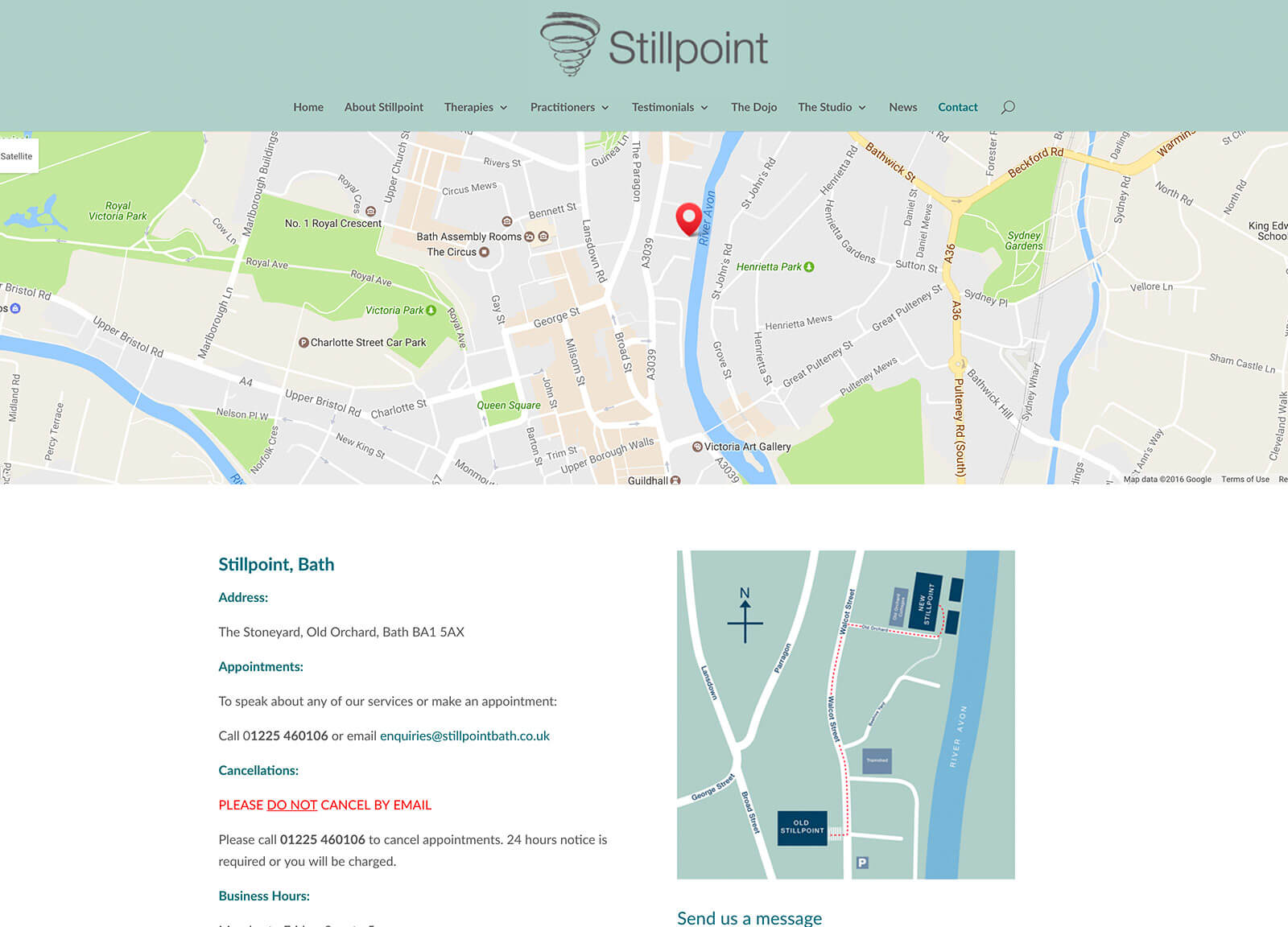
- Google map contact page
- Search facility
- Blog / News Section
- User friendly content management system
Talk to us about your website design project – 0800 412 5333
Marketing and design articles to help businesses (and profits) grow!
Don't worry we hate spam too. We totally respect your privacy. You can opt-out and choose what emails you receive at any time!

