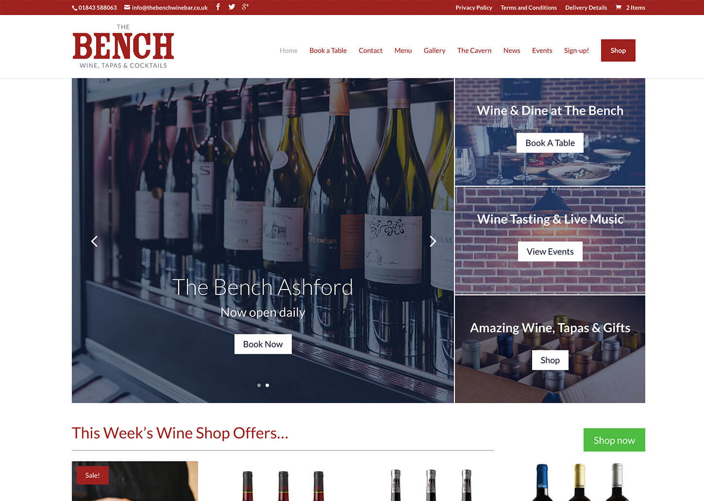
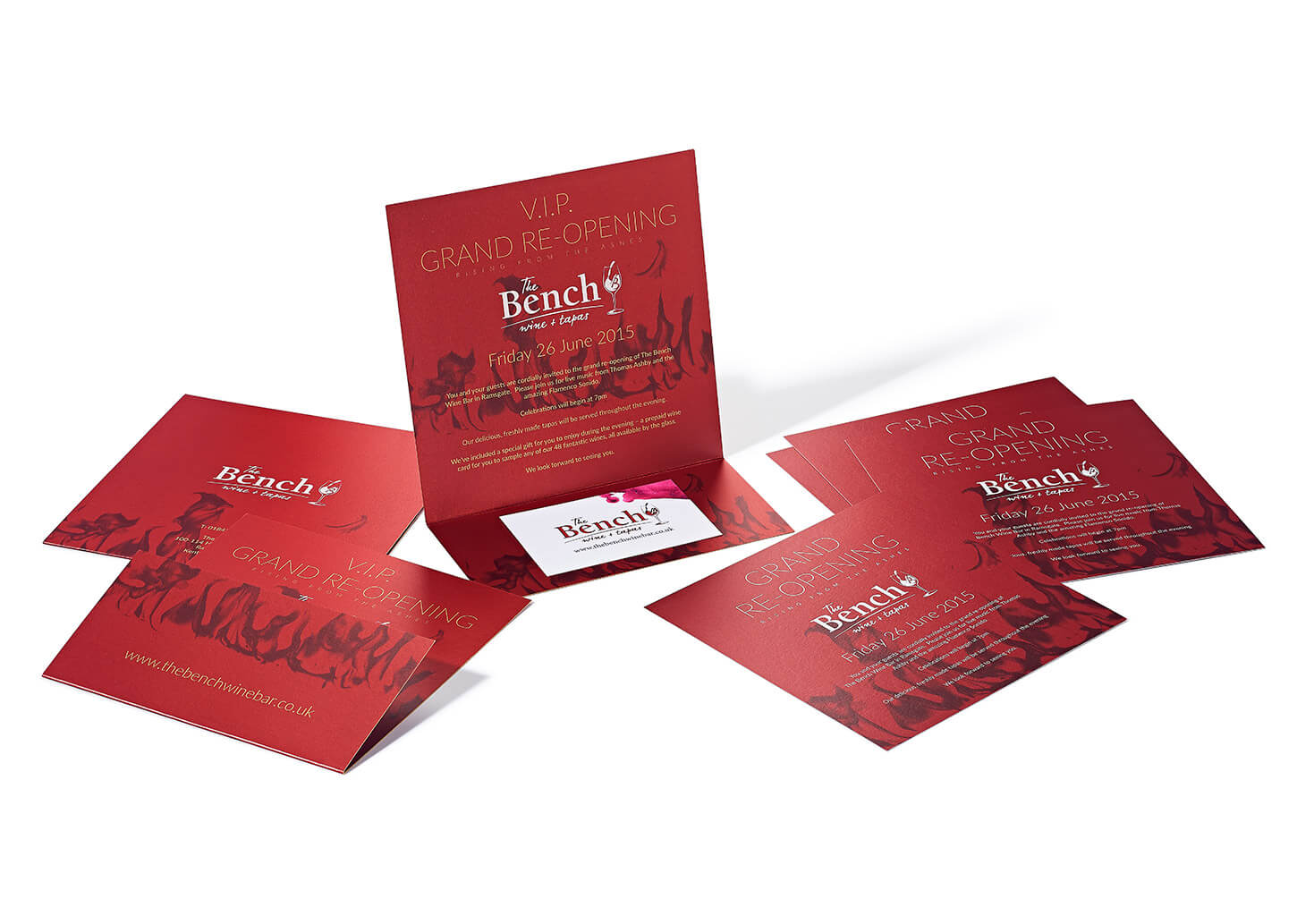
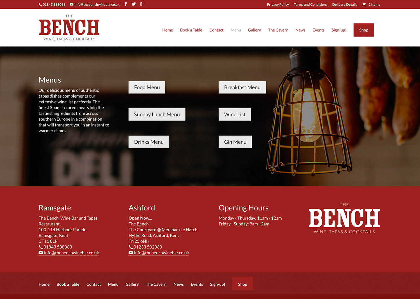
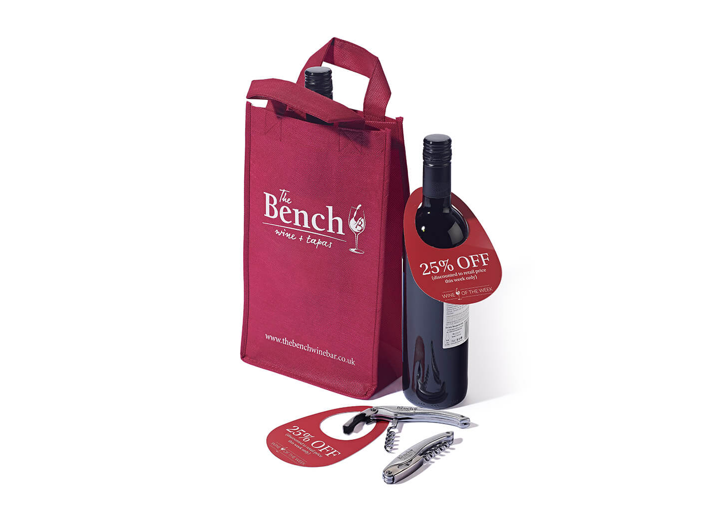
Print vs digital design has become the hot topic of conversation but should we refocus and make it about print and digital design in unison? – We think so, mixed media marketing campaigns are the future of modern marketing.
Marketing is one of those industries that is always evolving – first there was newspaper print so you used mail drops or ROP (run of paper) adverts. Then the internet came along and maybe you added a website, included some links, sent an email newsletter. Now we have social media, mobile friendly websites, search engine rankings and of course Google Adwords.
The basics of mixed media marketing campaigns
While it might seem obvious, there are a few subtle differences between print and digital that mean each has its own strengths and weaknesses. For starters, prints versatility means it’s campaigns can be designed for a canvas, a newspaper or a leaflet. The piece can use the whole of the canvas and can combine a host of different elements such as graphs, charts, maps, pictures and varied layouts. Print can be as complex as required because there is no concern about bandwidth issues and load times.
Website or social media adverts are more about scrolling than the two-dimensional nature of print media. The idea is to catch the reader’s attention in those first few seconds with a headline, then to encourage them to scroll down to read more. There are various other elements that can be used to attract the reader’s attention, such as video and imagery, however, again there is the concern about how much these elements slow down the loading speed of the page and make for a poor customer experience.
To summarise – print is about letting the eyes wander around, using spatial juxtaposition to create a pleasant visual environment and engage the reader that way. Online is about prompting the hand to move the screen with a mouse to find more information having been engaged by the initial area viewed.
Complementing not matching
Due to these differences, you will rarely ever find anything online and in print that are the same. If your mixed media marketing campaign appears identical across different forms of media you have a problem, they are not designed to be the same and customers interact with digital and print media differently, their design should be optimised for each platform. For example, even a magazine layout will look different in a print magazine to a digital, online version. And with advertising and marketing, the key is to find complementing styles rather than trying to match everything exactly – A few key identical items will bring the design together in whatever format they are required. Branding will do most of the work followed by copy and images.
For many designing a mixed media marketing campaign, the aim is not to pitch print against digital design but to use the two together in a complementary way. So a stunning, high impact print visual can attract attention, and then direct them to an online place.
B2B marketing is very effective here where companies can have something physical to take away with them. The use of QR codes are a simple way to bridge the gap between the real world and the online one. QR codes should only be used for short term campaigns and should not be the sole way for the customer to interact with the digital print.
There are elements that can carry from print to digital and vice versa. Top of this list is brand identity, imagery, and typography. So while the actual content may be different in the formats, these elements remain the same to create that sense of harmony and build the recognition of the brand. Customers see the combination of images, colours and typeface and connect with the print advert or email they have seen.
Making a mixed media marketing project available to everyone
While the printed artwork may direct the user via a call-to-action, the digital component of the project allows for the adverts to evolve depending on the results received from the print campaign. While you don’t have the ability to constantly change a printed document, you can make subtle changes and react to response with an online campaign – you could change the imagery, use a different headline or test the campaign with different landing pages.
The other major element in a mixed media marketing campaign is ensuring everything done for the digital side of the project is mobile friendly. It seems an overused phrase of late but Google does rate pages on their responsiveness (ability to resize) and be suitable to view on a mobile device. Although Google has recently announced (Aug 2016) algorithm changes that will look more closely at the way mobile designed sites deliver information to their users – read more here.
Ensuring everything from emails to landing pages and websites work on all device styles is crucial to success and never more important than now – which is crazy as user experience should always be the top of your priority list.
Don’t forget social media
It seems unlikely that any campaign would forget social media but a successful mixed media marketing campaign should incorporate elements designed specifically for the social media sites. This takes into account the best sizes and styles for each site to ensure that everything looks perfect, regardless of the platform it is viewed on. Social media can also be used to collect information for people to receive further marketing campaigns such as email addresses and even postal addresses, for newsletters or direct mail.
We’ve done the research, so you don’t have to:
- Graphic Design for Print vs The Web: 15 Vital Differences You Need To Know About – Canva
- Differences Between Print Design and Web Design – Nielsen Norman Group
- How To Combine Print And Digital Marketing Campaigns – Jeff Bullas
- Helping users easily access content on mobile – Webmasters Google Blog


