Designing business cards for print is easy! Right?
Proactive print thousands of business cards for clients every week.
We see lots of artwork come through the studio in varying degrees of quality. Generally, our customers have a good understanding of how to design business cards for print, but we nearly always find a few problems that require fixing to ensure they print correctly and avoid problems during the finishing process.
These simple tips can help anyone who is designing business cards to make sure they get the best result possible.
Reading this useful checklist before you start designing your new artwork;
1: Use a vector based program to generate the artwork
I would always recommend you create your business card artwork in a professional program such as Indesign – this is the most versatile program in the marketplace. It will ensure quick and correct production for your artwork and produce sharp editable text for precision layout. Illustrator is also perfect, as it is vector based but (IMHO) not as user friendly as Indesign.
Avoid Photoshop for business card text!
If I’m designing a business card I would never use Photoshop for any text placement. Text elements will always export as ‘Bitmap’, which is made of pixels rather than scaleable, vector objects. Of course, Photoshop has place in any design, but not when it comes to text, especially small text. This rule also applies to all other artwork such as leaflets and brochures – just don’t be tempted – you’ll get a better finished (printed) result if you stick to illustrator or InDesign!
2: Avoid colours that use more than three printing plates
One of the most common errors when designing business cards is the use of multiple plate colours.
There is absolutely no need to use every plate to create a colour. Colours created with more than three plates can turn out muddy looking and will not give a clean and crisp final print.
Four plate colours can also lead to mis-registration where the plates don’t quite line up and give a soft or blurred look to the print.
Four plate colours printed on uncoated stocks can also lead to set-off, where wet ink can transfer to another
It’s really important when applying colour to your text that you use the most efficient colour possible. Black is often supplied in artwork incorrectly – for example we often get c61 m48 y45 k100. This usually occurs when a black colour has been converted from RGB to CMYK. All you really need (especially for text) is c0 m0 y0 k100 – the difference is that one plate is being used (k-100).
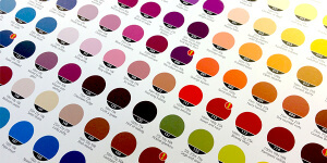
We have some really useful colour charts in the studio that list a wide selection of good colours to use. If you’re ordering business cards or any other print from Proactive and want a colour chart for your design reference, give the Studio a call on 01202 315 333 and we’ll be happy to pop one in the post for you.

One final note on colour… never use the registration colour swatch for any graphic elements in your design. Just because it looks black does not mean it will print black. ‘Registration’ is used by the software to produce the crop marks and other printing marks and will not appear on the artwork when the plates are generated. It is not such a common mistake these days but worth noting!
3: Don’t make your text too big or too small – it’s a fine balance!

When a client returns a proof and says “can you increase the font size, my eyes are not what they used to be”, you need to make a judgement call. Are you designing for one person (i.e the client) or for the many hundreds of people that may see that card in it’s lifetime?
Not everyone needs glasses or suffers from poor eye health, but I would suggest you never use a font size smaller than 5.5pt as this really is the limit of acceptability.
Remember you are designing an item that is meant to be useful and anything that hinders the viewer could be deemed unhelpful. We all know that large text can look unwieldily on such a small space, so just be careful and considerate when creating your artwork.
4: Don’t place your text or logos too close to the edge!

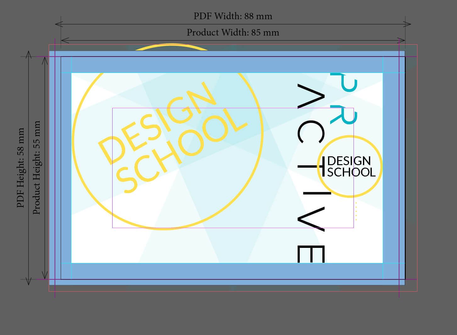
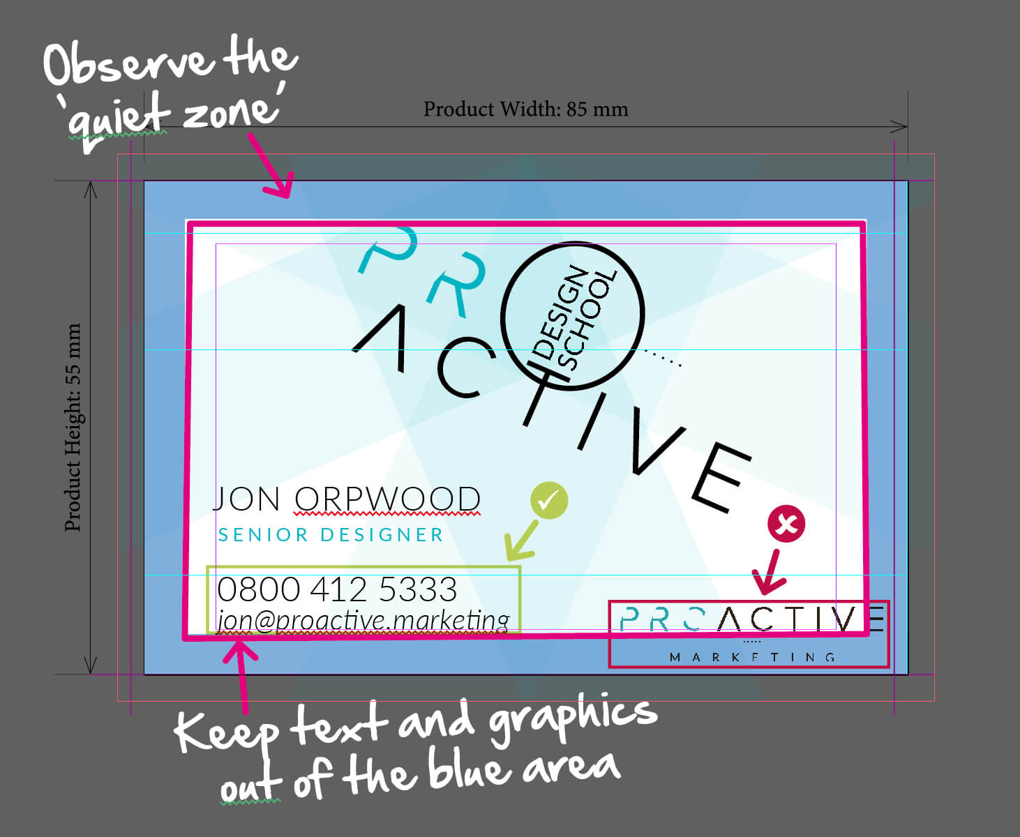
This is a real bug-bear of mine. I shouldn’t really need to explain this but I regularly need to request that designers observe the ‘quiet zone’.Often asking them to make sure they place nothing within 4.5mm of the edge of the card. You’re probably thinking ‘what’s the big deal?’ Well, apart from it looking awful, when text and logos are placed too close to the edge, you run the risk of the card being trimmed unevenly and chopping off some of your important information.
5: Always include bleed and crop marks

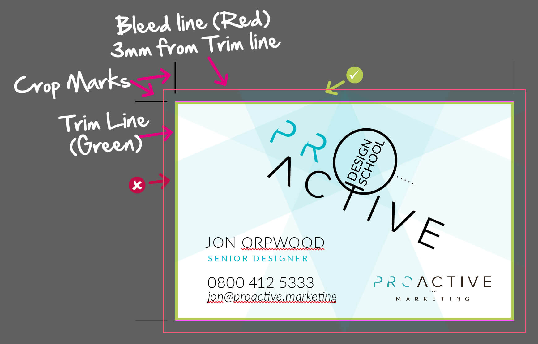
If you have any background graphics, blocks of colour or patterns on your business cards, you must include 3mm of bleed and crop marks in order that your cards look perfect when trimmed. We would never send cards to print without bleed.
The example below shows how the graphic element should be continued beyond the trim line of the card. The green tick shows correct use of the bleed, where the artwork is continued past the trim line.
The red cross shows where the graphic element has not been fully extended – this could lead to the graphic not hitting the edge of the card and looking like a printing mistake when trimmed.
Finally, always add crop marks – this helps the printer to position your artwork when setting up printing plates and is a quick and simple step that should be second nature with any print job you produce in the future. Programs such as Indesign and Illustrator will have a crop mark setting in the PDF export section, so just make sure this is selected.
If you found this useful, please share it with your communities and if you want any advice on designing business cards or require a quote for printing, get in touch, we’d love to help!
