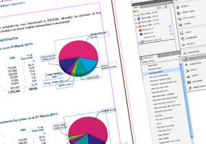
Creating artwork correctly is simple if you follow the advice below
 If you think your creating artwork correctly for print, have a quick read of this blog post as a quick refresher and see how many of these tips you can put a tick by.
So, your boss has asked you to create a new promotional item for your next conference. It might be a simple postcard or maybe a presentation folder, whatever the item, the basics for creating and supplying industry standard artwork are the same.
These simple tips should ensure you start creating quality artwork that won’t cause you a headache in the future and won’t be an embarrassment when your boss asks you why you are resupplying the artwork for the third time.
Follow these valuable design tips:
- Plan the job: Before you start, work out whether you’re printing in CMYK, in spot colours, using spot UV gloss high-lights or whether you need to create custom elements like dies for shaped designs.
- Agree the concept: Get approval from whoever is in charge of the budget, agree quantities, then request a quote from your printing company. Top tip: Discuss your ideas with the printer, they can always advise on ways of saving money, and suggesting alternative solutions if something seems a problem or prohibitive.
- Choose a suitable design program: Indesign (part of the Adobe creative suite) is an industry standard program, in my opinion this is the most versatile program on the market. It integrates seamlessly with Photoshop and illustrator (all the tools you really need). Top tip: Don’t use office based programs like Word, Excel, Powerpoint or Publisher. (Check out this blog post about MS publisher to see why)
- Setting-up your artwork dimensions is essential: When creating artwork correctly for print, ask your printer to specifically tell you the dimensions of the artwork, how much bleed to add, whether they require crop marks and pages as single or spread PDFs. Some printing companies will have slight variations on supplying PDFs. E.g You may be asked to supply artwork without crop marks, but may be asked to include 2mm bleed on the artwork.
- Create master pages: A good document will always contain a set of master pages, these are such a useful way to quickly replicate a page design across several pages. It is easy to create multiple pages for brochure covers, left and right pages, inside covers etc. This is also where you would add your page numbering markers.
- Set-up your document in layers: All software has the capability to create layers, work methodically and think about what you may need at the start. E.g You always need a base artwork layer – place text and images onto this layer. If you want to add a cutter template, or spot UV, add additional layers and name them appropriately – You can then turn the layers on and off as you progress through the design and also export PDF with single items on for your printer.
- Add colours to your palette: If you have corporate colours or brand guidelines to follow, add them as individual swatches at this point. You’ now have them at hand to add to fonts, fill backgrounds, or create gradients. This will save you time in the long run.
- Use style sheets for fonts: Always set-up your artwork with style sheets to control typefaces, font sizes and font colours. This is a fundamental time saving part of every job you do, imagine if you’ve finished your 10, 20 or 100 page brochure and your boss says change the font size by .5pt – without a style sheet, you will have to manually select all the offending text and change it piece by piece, with a style sheet you can simply change the parameter in one place and it will change across the whole document instantly! Before you rush into designing, do this basic step first. It will be the best 10mins you ever spend – especially when you get ‘the request’ from the boss!
- Use style sheets for paragraphs and reoccurring layout items: Like fonts, make life simple for yourself! if you have lots of bullet point lists in a document, design it once, then make a paragraph style based on that list. When you come to the next list, paste in your text, choose that style and ‘hey presto’ – it’s formatted! apply this to other items like tabbed areas, headers and sub-headers.
- Use vector logos where possible: If your logo is vector (100% scalable) then you can’t go wrong – it will always print sharply at whatever size you decide to use it. Tiffs and Jpegs are not the same and will pixelate if blown up beyond their largest size.
- Use CMYK, 300dpi (or larger) images: Always convert your images to CMYK and make sure they are at a minimum of 300dpi. Images printed as RGB will appear differently from how you previewed them on screen. RGB is a computer format for displaying images on a screen not on a printed page – Always convert before inserting into your document.
Are you creating artwork correctly for print?
If not, these best practice quick tips should help you set-up the perfect document for print, and if nothing more – will save you time and money in the long run too. Remember: If in doubt always ask a professional for design advice – that’s what we’re here for.
