Get seen at tradeshows with banner stand printing
We print a variety of exhibition and trade show items for our clients: from name badges to pens and notepads, but the one thing we do recommend for your stand or booth is banner printing or roller banner stand printing.
Banners have a variety of uses such as attracting traffic to the area, promoting special offers or products or to enhance brand awareness.
1. Branding
Your banner stand is another platform to promote and raise awareness of your company. It should match your corporate colours and use the same brand guidelines as your other company literature. In general, banners and any other printed materials represent your company and people will make a judgement on the quality of your products or services based on how ell they look and the quality of the presentation – this becomes even more important when you are trying to attract people to your stand or booth at a show.
2. Banner size
The larger the banner, the bigger the impact but make sure the size of the banner is appropriate for the purpose. Small exhibition areas may require compact roller banner stand, whilst a conference stage may require a 3m wide PVC banner with eyelets for ease of hanging.
3. Keeping it simple
You won’t get a second chance to make a good impression. Your banner needs to grab people’s attention and hold it. Banners filled with paragraphs of small text won’t do any grabbing or any holding! Stick your logo on there so it’s visible from at least 10m away, use a headline that sums up what you do and why people should work with you / what special offer you are promoting and use a few images to show off your products or services.
4. Fonts and colours
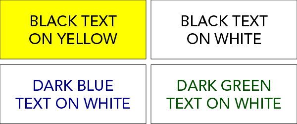
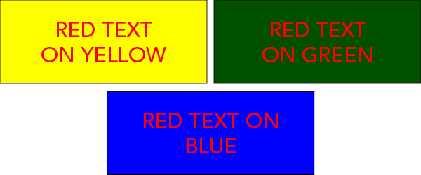
This ties in with keeping it simple. Interesting swirly fonts might be perfect for a fancy event invitation but they won’t work on a banner. Remember that your aim is to draw people over to you – if you have an amazing offer on your banner that people can’t read because you used an illegible handwriting font, they will walk straight by! Make sure that the colour of your text stands out against the background. Best banner colours include black on yellow or white, blue on white or green on cream. The most difficult colour combinations to read include red on yellow or green and red on blue.
Use these colours…

Don’t use these…

5. Call to action
You could follow all of the above tips when designing your banner but it would all be for nothing if your call to action wasn’t effective. Think about the purpose of the banner, the purpose of your time at the exhibition: do you want people to sign up to your newsletter (in which case, try using a QR code that automatically links people’s email address to your mailing list), do you want people to come over for a chat about your new range or do you want people to enter a competition to win a sample of what you sell? Give people a sense of urgency to do something by providing an incentive, for example “sign up to our newsletter NOW – the first 100 signups will get 10% off their next order!”
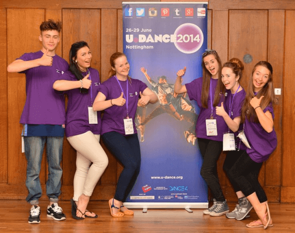
 We recently printed banners for our client Youth Dance England, who regularly use banners to promote their presence on social media and to get their students and prospects interacting online. They supplied print ready artwork which we file-checked and printed within 5 working days.
“Really quick and helpful service, and just the product we needed. Thanks!”
