Airbnb logo redesign causes a stir online
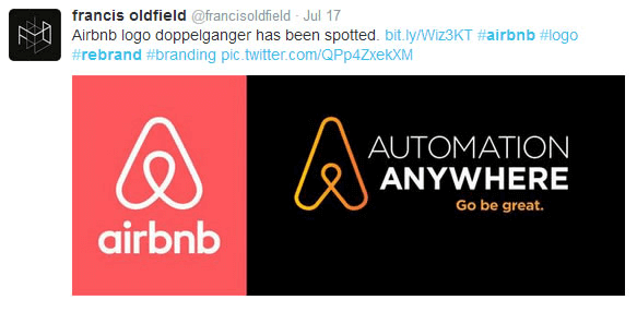
This week, the Airbnb logo redesign caused a huge stir online. Many commentators were suggesting that the logo represented female sexual organs, whilst others suggested it strongly resembled another companies branding, Automation Anywhere’s logo.
The rebranding project carried out by London-based graphic design firm DesignStudio, is said to have taken a year. Ben Wright, DesignStudio’s founder, told the BBC that seven members of the team had worked on the logo redesign and had not been aware of Automation Anywhere’s logo, nor had they recognised their design’s sexual connotations.

Airbnb call the logo Bélo – a symbol of universal belonging. Their blog describes it as “a symbol for people who want to try a new tea they’ve never heard of from a village they couldn’t find on the map. It’s a symbol for going where the locals go – the cafe that doesn’t bother with a menu, the dance club hidden down a long alleyway, the art galleries that don’t show up in the guidebooks. It’s a symbol for people who want to welcome you into their home for new experiences, new cultures, and new conversations.”


What are your thoughts on the new Airbnb logo redesign?
We personally think this a good strong identity and a briliant use of identity for provocation. As a way to raise profile and awareness of the brand this ticks all the boxes. As for copying someone else’s logo, I’d be surprised if a company with as much experience as DesignStudio would be plagiarising another firms ideas for personal gain – you’d be mad or stupid to not thing that such public work would not be scrutinised and compared to similar ideas already out their in the market place.
That’s what we think, but do share your own thoughts below… Tata!
Sources: www.bbc.co.uk/news, www.twitter.com

