1) Choose the right paper.
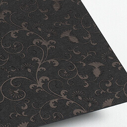
To many people, paper is paper. Simple as that. However there are actually thousands of different brands of paper, from many different manufacturers. They vary hugely in price, with each having its own benefits. Consider the overall specification of the project, including your budget, when choosing which paper to use. You will normally find your printer will have some good advice. For example, if your job is going to be laminated, it’s a waste to invest in a high end paper stock as you’ll cover up all the benefits. At the other end of the scale, a cheap paper stock can sometimes reduce the quality of the print. GF Smith are the daddies of high end paper stocks – if you want to do something really special, then check them out. You should always get paper samples before committing to the project.
2) Try a fancy finish.
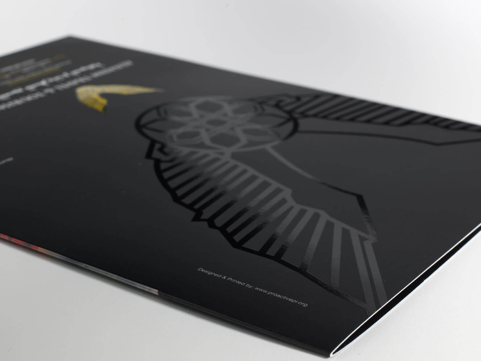
 There are many finishes you can apply to your print to give it some real impact. At the basic level, this might just be a matt or gloss laminate – as well as the tactile feeling in your fingers, it has a practical benefit of protecting the print underneath. You could also consider gloss spot UV, where glossy highlights are applied to specific areas of your design. Some of the classics have stood the test of time, like foiling and embossing (or foil embossing!). Nowadays foils come in a multitude of colours and styles, far more than just gold and silver.
Get your thinking cap on about how you could do something a bit different.
3) Shape it / fold it.
You could add a die cut shape to your flyer/brochure, or cut out a window to give a sneak peak of what’s inside. You can work the shape around your design, or come up with the shape first and work the design around that. You could try an unusual fold to entice the reader in, or make it spring out of the envelope so it’s impossible to ignore!
4) Plan it.
Think about what has worked for you in past (and what hasn’t), and work your material to fit. Don’t be afraid to try something new, but always monitor the results. Your marketing will need to evolve both with your business, and your industry as a whole. You want to base this on informed choices rather than running in blind.
5) Get an experienced graphic designer on board.
A graphic designer is essential for the later phases of the project as they will need to put the print ready artwork together to pass on to the chosen printer (NEVER attempt this yourself in Publisher, Word etc – see elsewhere on our blog for the reasons why). However it is also a really good idea to get your designer involved from the outset. Designers are great at coming up with ideas – make the most of them!
6) Go all out.
If you really want to push the boat out, then there’s a wealth of choice out there: thermochromic (changing colours with heat/cold), photochromic (changing colours in sun or UV light), scratch & sniff, glow in the dark, sparkle spot UV, unique personalisation… the list is endless. Speak to your designer AND printer to get the best of their knowledge.

7) Know your budget.
These finishes are all well and good, but what you can afford will always be a constraining factor. From our experience people fall in to three categories; they haven’t considered their budget at all, they know their budget but do not want to reveal it, or they’re happy to tell us their budget from the outset. Maybe unsurprisingly, but the third group of people are the easiest for us to work with – but more importantly, they also get the best results. I understand why people are hesitant to reveal their budgets, no one wants to get ripped off. Ultimately though, if you can’t trust your printer enough to reveal your budget, then they are not the right printer for you. There will be a reason you don’t trust them, even if you’re not quite sure what it is, and that relationship will ultimately end up in tears! If we know your budget from the outset, we can work within to get you the very best for your money.
