Make your customers mouths water with these simple restaurant menu design tips
First impressions count! Designing a functional and user friendly menu for your restaurant is crucial, so taking the time to get the design and aesthetic right is really important to ensure your culinary offerings appeal to your customers.
We’ve devised these simple restaurant menu design tips to help you make the best menu artwork possible.
Restaurant menu design tips 1-7:
1: Reflect your restaurant’s personality
Your menu design should exude your restaurant’s qualities and standards. With so much choice available to diners, you should use your menu design to shout about what is unique about your food, and to guarantee your diners mouths will water.
Do you offer fast, cheap food for customers in a rush? Or does your restaurant pride itself on a fine dining experience? Then you need to tailor your menu design to meet your customer’s expectations.
2: Represent your dishes visually
The most important aspect of menu design is appealing to your customers needs. Whether they glance at a copy of your menu online, in the window or at the table, you want to grab their attention so they can start imagining your delicious, fresh food on the plate in front of them.
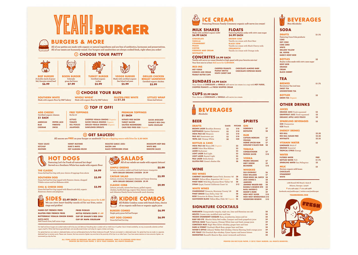
Some diners might refer to themselves as carnivores so appealing to their tastes with traditional style ‘meaty’ graphics could be appropriate. On the other hand some diners will be more interested to know where their food originates, whether it is locally produced, organic or free-range. Maybe try using icons to differentiate different sources, style or origin of food to help your diners find what they desire.

3: Don’t use images
We would almost always discourage using photography on your menus to represent specific dishes. The implications of using photography are as follows:
- Your menu may change – ingredients may become unavailable.
- You may want to change the way a dish is presented – if you have a picture showing it served one way and it arrives to the diner another way, you could have an unhappy customer and the dish may come back to the kitchen.
- Photography is expensive and photo shoots are time consuming – You need to make your food look beautiful which requires time and investment and potentially a member of staff tied up all day preparing food and giving direction to the photographer.
Of course there are exceptions:
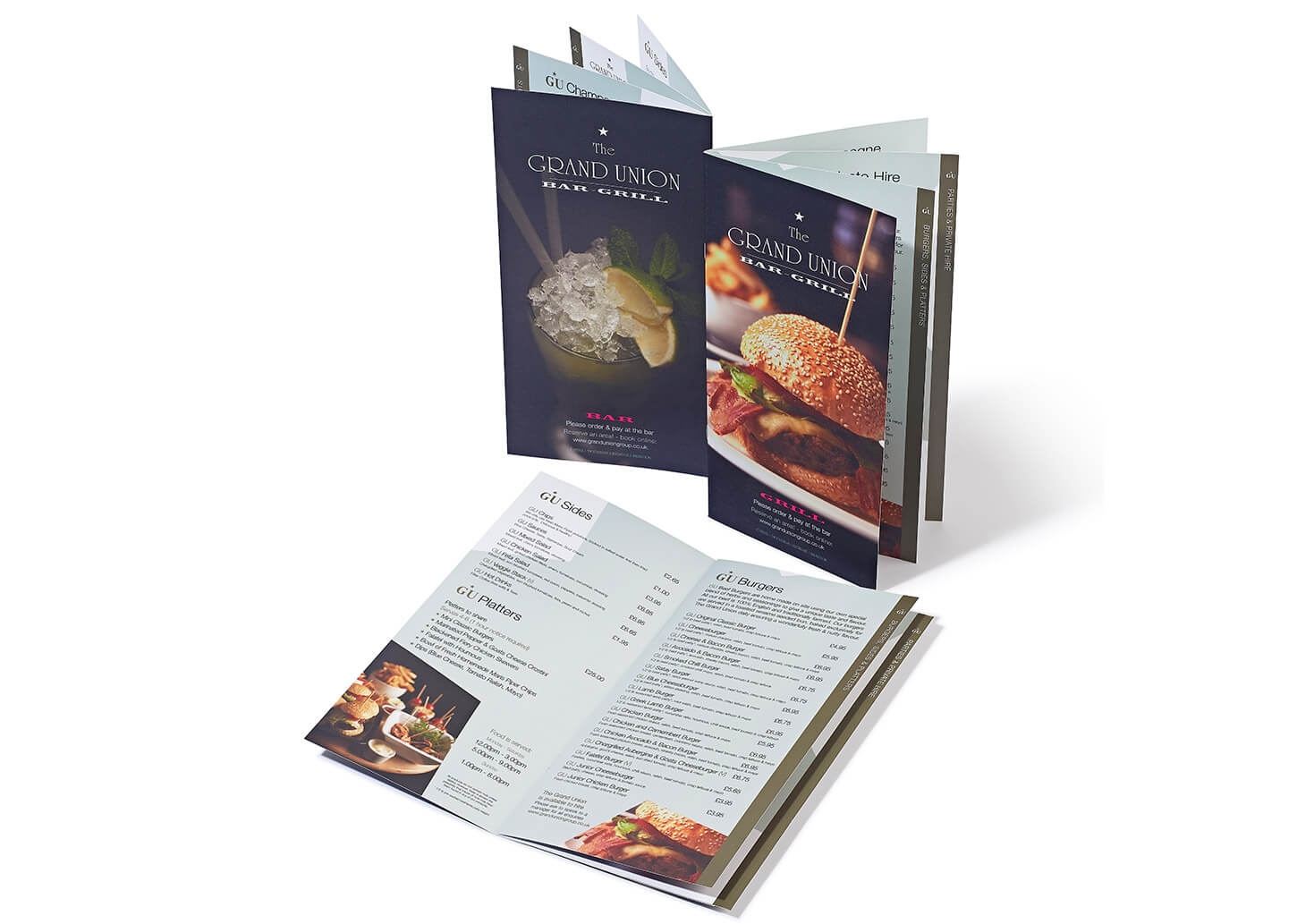
- If your food is beautifully presented and professionally photographed you could use images on the cover of your restaurant menu if that type of design will suit your establishment. But this is quite a niche market and is not right for everyone – If you’re selling ‘artisan’ burgers and shakes this approach would be ideal.
- Ensure you choose generic images. Images that maybe include a variety of food types and drinks or an image of a place setting with the focus on several items rather than just one particular dish – but always professionally shot and set-up – camera phone photography is a definite no-no.
4: Design your menu like your restaurant
We don’t want to teach you how to suck eggs, so the following section may seem obvious to most restaurant owners but… If your restaurant is ultra modern then your menu should ideally reflect the same design values and be designed with a clean style.
5: Design your menu for it’s environment
Ask yourself these questions…
- Where will your menu be displayed? This may determine the size and paper stock you use – if you are displaying the menu in a window ensure you have used UV resistant inks that won’t fade.
- What type of menu will suit your customers? Will you need a placemat style menu, or will your menu stand proudly in the middle of the table?
- Does your restaurant have a high turnover of customer? Use a gloss or matt laminate to increase the lifespan of your menu.
- Does your menu change frequently (daily / weekly / monthly)? You could choose pre-printed, laser printer friendly backing sheets. You can print your menus in-house to ensure the most cost-effective use of your menu budget and keep your menus as current as you need.
6: How many menus should you create?
Do you need a different menu for breakfast, lunch and dinner? If you offer certain meals at certain times it may be an idea to have a separate menu for each of your services. As well as food menus, have you thought of separate menus for drinks, seasonal offers or maybe even a interactive menu for kids? Having multiple menus gives you the opportunity to tailor the design to match the time of day you are serving.
7: Menu descriptions are very important
Description are key to whetting the appetites of your potential customers. Less is more! But if you have something really special to shout about then make your words descriptive and powerful. Diners tend to scan them quickly (spending an average of just 109 seconds, according to a Gallup poll). Be passionate, descriptive and concise! If writing isn’t your strong point then hire a copywriter – your original descriptions can be transformed into beautiful flowing text by the right copywriter.
However you decide to design the content of your menus, check it twice and then get someone else in the restaurant to read it too! You don’t want the embarrassment of customers pointing out punctuation or spelling errors.
8: Legalities
The are various legal rules that must be followed when labelling and pricing food on menus. Be sure you stay within the law. Visit the food standards website for more advice.
We hope this article has given you some great restaurant menu design tips, but if you need some extra help bringing them all together, don’t hesitate to get in touch. Give one of our friendly team a call, or visit our menu case study for examples of our previous work.
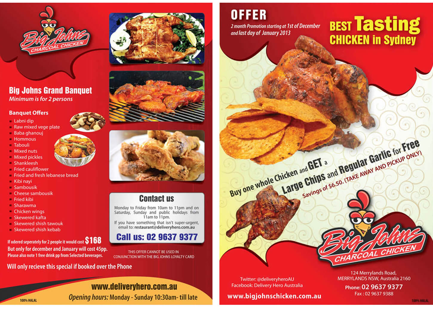
Check out some of these restaurant menu design projects we’ve completed for our clients.
We’ve done the research, so you don’t have to:
- Graphic Design for Print vs The Web: 15 Vital Differences You Need To Know About – Canva
- Differences Between Print Design and Web Design – Nielsen Norman Group
- How To Combine Print And Digital Marketing Campaigns – Jeff Bullas
- Helping users easily access content on mobile – Webmasters Google Blog


